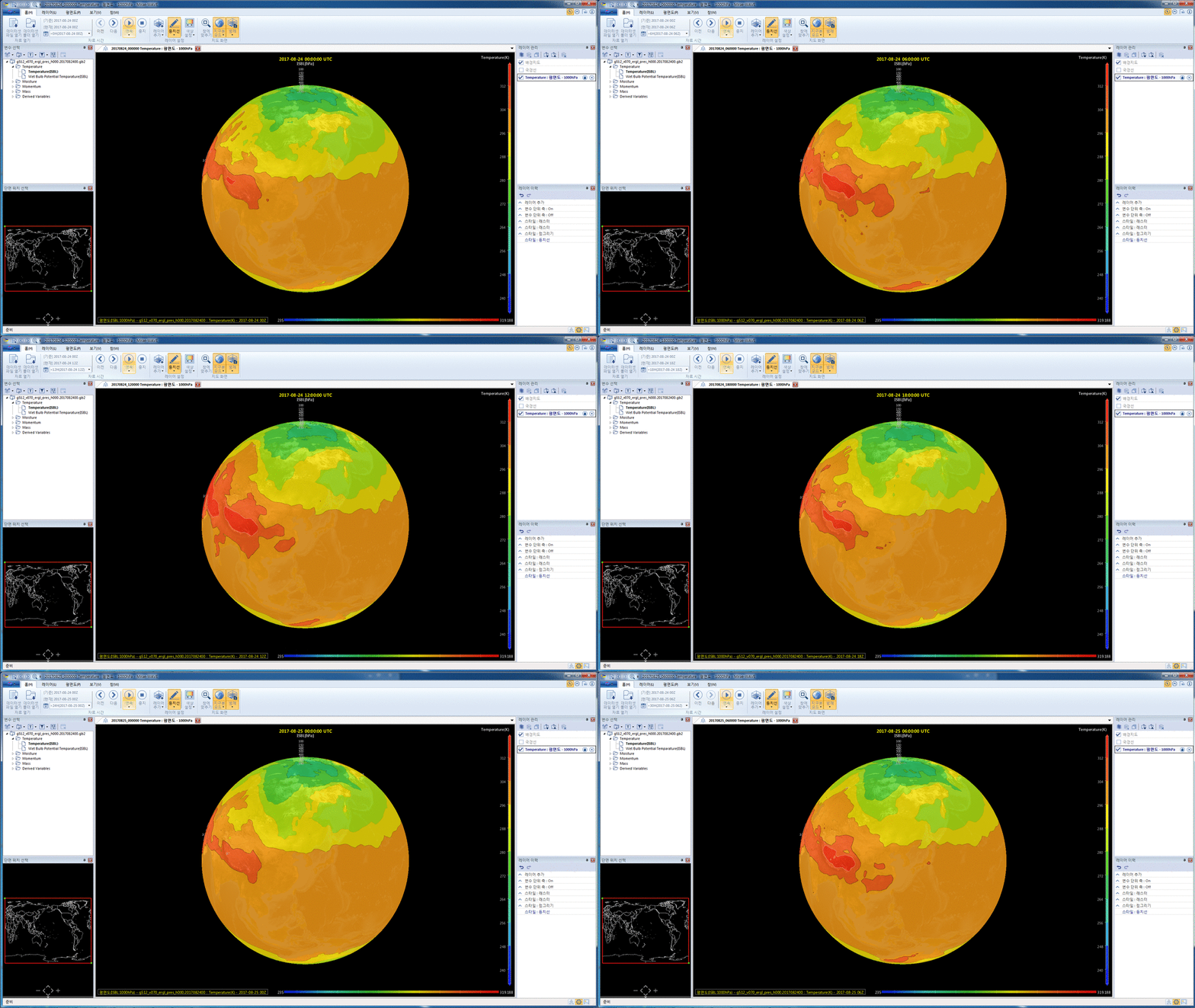
온도분포의 시계열자료 표출하기
NOTE: Most parts of this guide can also be applied to the visualization of any time-series data.
For the terms & names of UI components, refer to UI Components.
1. Open data files
Note that you need to open a list of data files at different time stamps to see the change of data over time.
In order to open the list of data files:
- In Menu Bar, choose Home menu category.
- In Open Data panel, click Open File.
- In the Open dialog box, navigate to the folder containing the list of data files. Press and hold the Shift or Ctrl buttons while selecting data files. Then click OK button.
Note that the Variables Pane only displays the first data file in the opened list.
2. Load the temperature data and show it on a layer.
In order to visualize the distribution of the variable on a layer, you can either
- choose Layer menu category in Menu Bar, then click Horizontal Plane in Add Layer panel; or
- select and right-click the temperature variable on the Variables Pane, then select Add Horizontal Plane.
Rendering Pane will immediately display the temperature data, and a new layer will be added to the Layers Pane. By default, the temperature data will be shown with Contour option.
3. Change the visualization style - contour vs. raster vs. dot (optional).
On the Horizontal Plane menu category of the Menu Bar, you can select one of the following visualization styles in Style panel:
- Contour : show distribution with discrete iso-level contour lines (optionally with filled colors)
- Raster : show distribution with smoothly filled colors
- Dot : show distribution with colored dots for grid points
Each menu button has drop-down submenu, where you can set various options for each visualization style.
Each menu button has drop-down submenu, where you can set various options for each visualization style.
4. Change the settings for color mapping (optional).
Double click the vertical Color Bar on the right-hand side of Rendering Pane. In the Setup Colormap and Limit Range dialog, you can change various options regarding the color mapping.
5. Explore the change of temperature with timeline.
After loading the temperature data and showing it on the Rendering Pane, buttons in Data Time panel in Home menu category of the Menu Bar are enabled.

In order to see the changes of the temperature over time, you can:
- select the time stamp in the Select Time drop-down list and click the Previous or Next button manually; or
- click the upper part of the Play button and see the change continuously over time. You can also set the time interval and repeat option by clicking the lower part of the Play button.

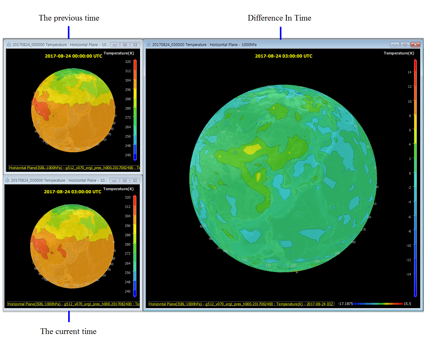
6. Difference In Time (optional)
In order to calculate and display the difference of temperature between the current time stamp and the previous time stamp, you can click the Difference In Time button in Horizontal Plane menu category of the Menu Bar.

| 이전 페이지 | 홈 (목차) | 다음 페이지 |
|---|
